The data and the results for the last 20 years

by Doug Brodie
/1. The white paper
Heads you win, tails you win.

Obviously, the perfect pension is the final salary scheme that pays out all the assets to your family on death, however, that’s not going to happen so we’ve put together the next best thing – the invested drawdown pension with income supported, instead of guaranteed.
This year’s white paper contains much relevant information for anyone planning the transition from earned income to invested income – retiring. There are many visuals, charts, tables along with discussion and explanation around the elements of risk, problems with Monte Carlo simulations, sequential risk, why total return embeds anxiety, undisclosed costs of annuities et al.
Data tables measure actual income and growth returns for twenty years to the end of 2023:
Investment increased by RPI each year.
Income of 4% of the starting sum, plus increasing that sum by RPI each year.
Drawing a flat 4% each year.
Investment trust portfolio dividend income alone.
For all these scenarios we run the figures generated by the following alternative investment methods:
HSBC FTSE100 tracker.
MSCI World index.
60/40 portfolio (60% MSCI World / 40% M&G Corporate Bond).
Investment trust portfolio.
Single life annuity.

/2. Data – rolling five-year increases

This is a snapshot of one of our analysis tables; it shows the percentage annual growth rate of income from a selection of trusts, measured on a rolling 5-year basis, a simple annual basis, and over 5 and 10 years. It also shows the total income that has been received by a single investment of £100,000 made at the start of 1987.
What of inflation?
Perhaps this table is of more value – this is RPI versus dividend growth, both measured on 5-year rolling periods. The only recent period when annual RPI (5-year rolling) was ahead of dividend increases was 1988 to 1992. In summary, from 1987 onwards the dividend increases were 129% more than RPI.

/3. Taking two to tango: cutting an Apple in half
This excerpt came from our learned chums at 7IM:


There were many stories in the market chaos of last week.
One of the big ones was what the Oracle of Omaha was up to…
Because Berkshire’s report showed Buffett cut his stake in Apple by HALF (selling about ~$75 billion worth of shares).
Not… that… helpful… for already nervous markets.
But I want to talk about the unintended consequences.
BECAUSE Buffett has sold Apple shares, all the major stock indices (S&P 500, MSCI USA, Russell 1000, etc etc) will have to INCREASE their weight to Apple.
They’ll be buying about an extra $40bn* worth come September.
So, if you own any of the normal US trackers, you’ll be increasing your Apple holding in about a month.
What?!
You see, the rules governing stock indices** say that when big long-term investors hold a lot of shares, these shouldn’t be considered as publicly available to buy.
And the weights in indices are defined by what’s publicly available – what the likes of you and me can buy.
While Warren (the literal definition of a big, long-term investor) was holding his Apple shares, he took them out of play – only 96% of Apple was publicly available.
With most companies that sort of rounding doesn’t matter.
But Apple is worth $3.3 trillion. Adding back in 4% is the same as adding a whole Goldman Sachs, or Disney, or Uber.
Which means that purely passive investors will be buying Apple, at just the time that the world’s greatest investor is selling. It’s not your fault… but it’s not your choice either.
*200 million shares, as per Piper Sandler research
**20 lovely pages of rules for you here 😉 - https://www.spglobal.com/spdji/en/documents/index-policies/methodology-sp-float-adjustment.pdf
Ben Hutton – 7IM
(Fascinating observation – Ed.)
/4. Race to the bottom
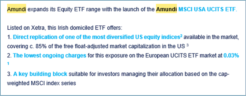
Very hot off the press, and you know that the good people in Amundi’s marketing department have had weeks of discussions about whether or not this is the right or very wrong time to launch a US tracker. The fund charge for this ETF is a paltry 3 basis points (0.03%) – that’s half the 0.06% of most other trackers selling themselves as cheap. We are told, perhaps apocryphally, that there are giant US trackers with charges based on tiny, tiny percentages of basis points. It’s interesting if you read the section above about Buffett selling half his Apple shares, the natural market counterparty is the trackers – so if you don’t want to still be buying Nvidia etc at silly high prices, don’t use a tracker. You track all the way up, and all the way down – there’s no cap on the upside, no safety net on the downside.
If you don’t know them don’t worry, Amundi is not a mainstream UK retail manager, but you should know that they are French and they are the largest asset manager in Europe, top 10 worldwide, with over €2 trillion under management.