Don't go chasing rainbows

by Doug Brodie
Nvidia – up when it’s up


103x??? That’s some return. Back in 2016 you were probably a little downhearted by the death of David Bowie, zika virus was causing issues with the Rio Olympics, BJ succeeded in getting the learned UK voters to back Brexit and DJT became the 45th PoTUS.
You probably weren’t thinking about Nvidia back then, but Baillie Gifford was, and they bought £65m of its stock. Over 2021 to 2022 it fell -56% - what would you have done?
Another biggy you can see in the table above is the 11 bagger that is Baillie Gifford’s holding in Ferrari. Well history tells us that luxury car makers are a very poor investments – customers are fickle, maintenance schedules are compulsory, and you can’t really DIY, but hey, Ferrari has done a sterling job on its commercials, and investors like to hold its shares.
This was when you were a teenager
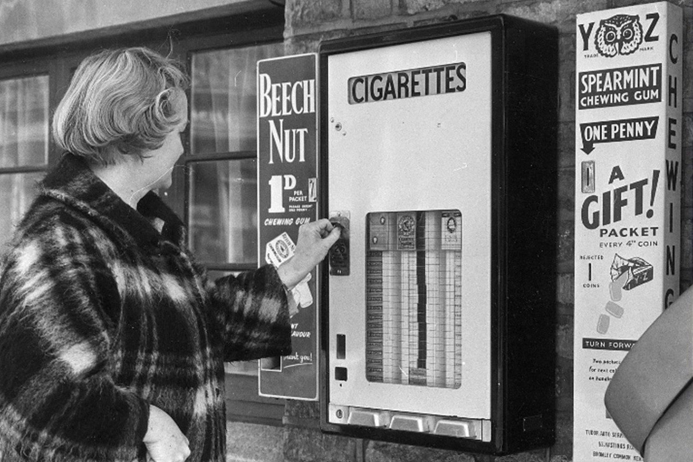
I can’t see too clearly but I think that’s a Players only cigarette machine. Remember Beech Nut? I wonder if these machines were placed together so that smoking schoolboys could try and disguise their nicotine breath in front of their teachers? (I’m afraid to say that was me, and it never worked.)
This was around fifty years ago – and the interesting thing about the photo from your early years is what has changed: Beech Nut is gone, cigarettes have virtually gone, their advertising has been banned and they are only on sale when hidden from view, never mind a vending machine. On the right is more chewing gum, and like the Beech Nut, it’s 1/d – or just one penny. Decimalisation was 1971 so the photo will be from around then.
Roll forward another 30/40/50 years and what of today’s normal products will have disappeared? Inflation will have destroyed the value of the £ in your pocket so its pretty important to ensure that your income in retirement keeps pace – not slavishly, just keeping pace over the years is sufficient. We measure in five year rolling periods and have all the data going back to 1986 for direct comparisons. This is one of our favourite charts – a great example of a visual display being all the explanation that is needed to answer the question. This shows two lines for F&C investment trust – the blue line is a dividend at the start that is then increased each year by RPI. The red line is the actual dividends that were paid over that term. Our table in the office allows us to look at different start and end dates, however for a flat chart in this blog this works:

It destroys inflation increases over that thirty year period – shouldn’t all pensions be like this?
When irrational kicks in.
We speak to people about the black and white of their own money every day, along with the grey, non-binary aspects of future investment returns. Often people take their accrued wealth at the end of their working life as a marker, a score of how well they have done. They almost come to us with the factfind filled out for us to mark like a teacher with homework.
From time to time we see irrational behaviour – experience has taught us that when that happens there is always a hidden reason behind the behaviour. The reason is most frequently, almost always financial. When we have an ‘alpha male’ realising in front of us that there’s a mismatch between his income expectations and the amount of capital accrued, we often see a heightened questioning about fees, illogical comparisons with other funds and a stubborn refusal to follow and accept rational and logical explanations. Odd behaviour.
I wonder if this chart is behind the odd behaviour we see in America just now – they have spent, and spent, and spent over the last thirty years and it shows; perhaps the current administration feels really uncomfortable about winning the Presidency and that its now their responsibility?

"The function of economic forecasting is to make astrology look respectable."
John Kenneth Galbraith