Stable Income Growth vs. Fluctuating Capital Values
This is the single most important chart for any income investor, it is the Key Chart for the selected portfolio.
What does this show? It shows the capital value change in each calendar year for 30 years (blue bars), overlaid with the actual income payments paid out over that period (red line).
Why is this important? The Chancery Lane algorithm creates portfolios where there is no or weak correlation between income and capital. This allows retirees to receive predictable income irrespective of what the FTSE is doing.

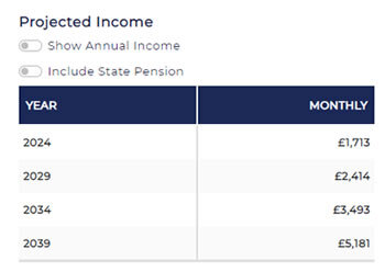
Projected Income
The projected income table allows you to take a view of what income might be received each year if the portfolio’s historical income growth rate is applied to the actual last year income. Past returns are no indication of future returns.
Figures are shown as annual or monthly figures.
An estimate of state pension can be included

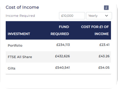
Cost of Income
The Cost of Income table allows you to enter the income you require and then calculates the funds required to achieve that income using your selected Portfolio, the FTSE All Share and Gilts. You can enter the income target as an annual or monthly figure. The second columns shows the same data as the cost of £1 in income.
If you wish to explore how these calculations are made, please contact us.


