Do you have £1 million?

by Doug Brodie
In this blog:
/1. “Is the manager in?”
/2. You don’t need to calculate the distance to the sun, remember Pythagoras, or measure the visibility to see the horizon.
/3. Do you have £1 million?
Irrational exuberance? At a time when US interest rates are the highest in the last 22 years, the world’s largest company is touching a value of $3 trillion. Its value has risen by 46% since the start of this year. Here’s the Jenga pile, which one do you think will fall over first?

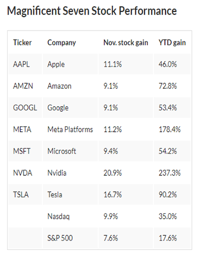
If you could do perfect timing, you’d obviously buy any / all of these US stocks and sell them before they fall and “this time next year Rodney we’ll all be millionaires”. It’s always about timing, and if you expect investment professionals to know the exact time to buy and then to sell, your expectations are way out of kilter.
A decade or so ago we ran a calculation from 1984 forward based on one simple investment decision: this week do you buy the FTSE or do you stay in cash? One, single, binary decision, no rocket science of PhD needed, only one decision per week.
When we ran the calculation, getting the decision correct every single time, starting with £10,000, by the 2000’s the sum had grown bigger than the total market capitalisation of all the stock markets on the planet – you owned the world.
There are lots of technical reasons why it’s impossible to accurately predict what’s going to happen in the markets next year, never mind next week. This is why we look at the horizon when investing, not the daily values of the markets.
A core driver of that investment horizon is basic materials – I’m not talking lithium for electric vehicles, but consider that Anglo American is spending $9 billion on a new mine in Yorkshire. Not coal, polyhalite, a type of fertiliser. Why?
Anglo’s research tells us that the world will need 60 percent more food calories by 2050.

We need to grow the same number of crops over the next 40 years that we have done in the last 8,000 years.
From agri-machinery to groundwater pumps to cargo trucks and ships to deep water ports to food containers to shops, there’s a huge amount of industry that will need to increase capacity to deal with just the change in food needs. The largest food manufacturers in the world today, and their share performances this year, are:
Nestle (-10%)
Unilever (-10%)
Tyson Foods (-27%)
General Mills (-24%).
The largest wheat flour producer is Wudeli Flour Group in China – it’s privately owned and has capacity for 80,000 tonnes of flour per day.
Who do you think is going to be more sustainable over the next decade? Apple and Tesla or Unilever and Tyson Foods?
/1. “Is the manager in?”
Andrew Bailey gave a speech on Monday, to the NFU. In that speech, he produced the chart below showing the cycle down of inflation. His mandate is a 2% CPI figure, and the Bank is projecting that will be achieved in 2025, though he thinks it will be 3% at the end of next March. (Of course, it will, there’s an election coming). However, he also said that the Bank’s team is “on watch for further signs of inflation persistence that may require interest rates to rise again”. We very much hope not. (Can’t be as bad as Turkey though, its interest rate has just jumped by 5% to 40%. Turkish Lira Cash ISA anyone?)


In April of this year, The Pensions regulator authorised the Royal Mail Collective Pension Plan, the very first ‘Collective Defined Contribution pension’ (CDC) scheme in the UK. To you and me, this is a defined benefit scheme without the guarantees or the big employer premiums.
It is a pension pool for employees where the incomes paid in retirement are based on the available money, members and returns, and can change.
A CDC scheme aims to achieve higher levels of investment return by sharing the risk between member employees over time. These ‘risk-sharing’ plans are already available in some other countries including Canada and the Netherlands. Compared with buying an annuity with an insurer, a CDC scheme is expected to achieve a 70% higher pension than an annuity purchase, although this is not guaranteed – Abbiss Cadres.
You’ll note this is still identified by reference to the contribution to be paid – that’s the simple bit and that avoids the key item for you, me and all the other people without Jeremy Hunt's final salary schemes. Mr Hunt’s pension is based on ‘pension’ being an income in retirement, and we think everyone’s pension should be defined in the same way. Behind the scenes down Chancery Lane, we are putting together the elements needed to apply our income investing techniques into single funds, so that all working people can benefit from a Collective Projected Income (CPI) pension when they retire. More than disrupting the retirement industry, we want to drop a proverbial bomb in the middle of this out-dated self-serving industry and provide everyone with their entitlement – a reliable monthly income.

/2. You don’t need to calculate the distance to the sun, remember Pythagoras, or measure the visibility to see the horizon.
You just open your eyes.

Photo: Diego Jimenez, https://diego.cool Atacama Desert, Antofagasta, Chile.
Imagine as a 25 year old you had been able to have all your 40-year lifetime earnings upfront; a starting salary of £12,500 growing at 6.5% per year would have delivered a total of £2.2m. Given that all one day, how would you have gotten on? Would you have convinced yourself, for example, that paying cash upfront for a car/house etc. saved any interest, so would be best? Or would you have ‘subsidised’ your living costs for an educational travel around the world? Gone back to uni? Having talked it through with your Mum, your older sister, your mentor, would you have swapped it back for the certainty of a 480-month income?
/3. Do you have £1 million?
How much income do you expect to get?
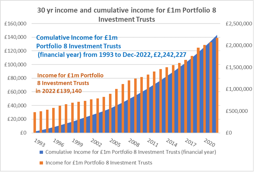
Welcome to the pension the government says you’re entitled to: here’s your lump sum. Now what are you going to do? You have two options: buy an annuity, or invest? Guarantee your income and forfeit your capital, or ‘probable-ise’ your income and keep the capital? Cutting out the detail and sticking to the income objective, the following three charts show the updated figures for a £1m portfolio spread equally across 8 run of the mill, long in the tooth, widows and orphans trusts. These are real figures, real values, real annual incomes, covering a person who started the investment 30 years ago, 20 years ago and 10 years ago:


The data informs us, however, it does not blindly direct us. Here are a couple of reasons why.
Dividends are cash sums paid per share, so if you change the amount of shares in issue, the amount of dividend as a whole changes. The income a trust receives is often quoted ‘per share’, as are the net assets. Bearing that in mind, this is a chart put together by Ksennia showing how the number of shares in a well-known trust has changed, and that percentage change, measured back over 25 years:

Something’s clearly going on, however, is it good or bad? How do you interpret it? What does the manager say? Or the board of directors?
Secondly, Ksennia also runs our database, tracking the balance sheet and equity reserves of the trusts: are they spending more than they earn? Are they simply blowing their reserves? If so, will they have to cut their dividend in a couple, 5, 10 years?
This is Scottish American – the blue bar is the income they receive, the orange is the dividends paid and the grey is the revenue reserves:

This is another household name trust, this time the income (blue) is still more than the dividends paid (orange), however, they have really hammered their revenue reserves over the past three years, desperately trying to maintain an annually increasing dividend.

These are not cash deposits, trust investing is pretty bullet-proof with predictability enabling us to run very, very accurate income projections – highly probable-istic. However, there are huge pitfalls and many bear traps to catch those blindly following quoted yields in the media (a bit like Woodford).
As we said last week, ‘it ain’t easy’.